Until last week’s hugely successful rumpus room reveal, Gold Coast couple Sonny and Alicia were slipping down the leader board on this season of The Block. After pulling off some impressive room reveals early in the competition, the couple struggled to define their signature style mid-way through the competition. This week they had no such problems, landing on a coherent layout and design that featured mid-century elements that tied in well with the high-end Daylesford brief.
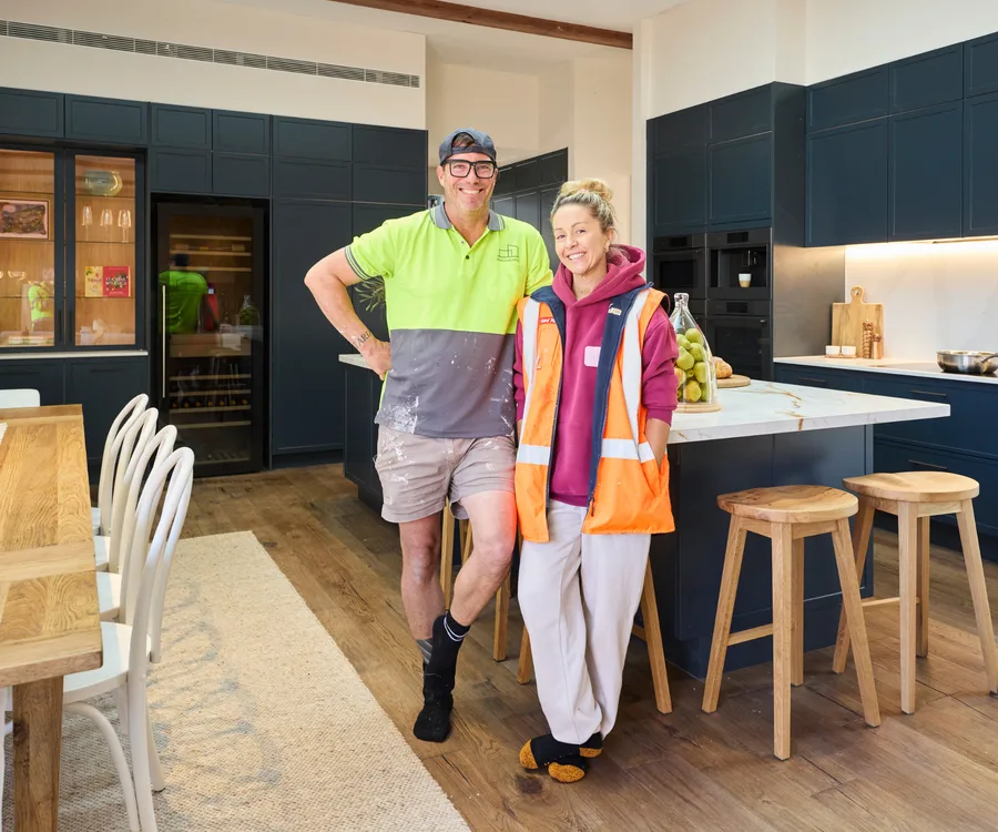
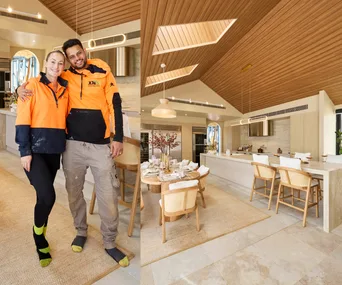
In this seventh week of competition, Sonny and Alicia elected to change the design of their kitchen from the architect’s intended layout, shifting the orientation of their island bench to take in views of the backyard. They took a risk and opted for navy blue cabinetry with complementary chrome accents and a neutral stone benchtop. Confident their bold choice would pay off, Alicia said she thought the kitchen felt expensive and expansive, while Sonny acknowledged the riskiness of their Baltic Blue cabinetry, but felt it suited their home.
Scroll on to see Sonny and Alicia’s Block house so far.
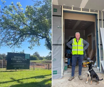
Who are Sonny and Alicia?
The Block’s Sonny and Alicia are a married couple and parents to three kids from the Gold Coast. Sonny, 44, is a plumber, and Alicia, 42, is a dental practice manager.
The couple were on the shortlist for last year’s season on Phillip Island, but received the exciting call this time around for Daylesford. “I was really upset last year that we just missed out, so when we got the call to say we were in it was an amazing feeling,” Alicia says.
While the pair aren’t experienced renovators, they did build their current family home and have renovated a granny flat in the past.
Read More
Tour Sonny and Alicia’s house on The Block

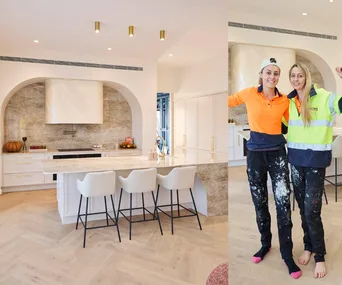
Kitchen
Not only did Sonny and Alicia complete a full kitchen installation this week, but they also completely redesigned the neighbouring living room, which was heavily criticised by the judges a couple of weeks ago. Implementing the judges’ notes, they sought to redeem the integrity of the room as a whole by resolving the colour palette and spatial layout of both zones. Picking up on the dusty blue tone of the kitchen cabinetry, the living room now boasts a smoky aubergine feature wall and reoriented furniture that spotlights the feature fireplace to its best advantage.
Although the couple from Queensland have often struggled with spatial planning, this week they knocked it out of the park. Darren Palmer, who was “besotted” with the kitchen in general, said they’d landed in the “Goldilocks” zone of spatial planning with a spacious and functional layout that was well thought out and perfectly executed. Shaynna Blaze loved that the space “had heart”, while Marty Fox wasn’t quite as taken with the space, saying he thought it wasn’t very ‘Daylesford.’ All agreed Sonny and Alicia’s hard work had rescued their home…for now!

Rumpus room
There was nothing half-hearted about Sonny and Alicia’s room reveal this week. The Gold Coast duo chose ‘Witching’ as their hero colour, and they went all in, drenching every centimetre of the walls, shelving and ceiling in the same rusty shade. They selected furniture and decor in complementary, netural shades, which allowed their colour choice to take centre stage. Far from boring, Sonny and Alicia’s execution of this room shows how interesting and layered a simple palette can be and how choosing the right colour for the right room makes all the difference.
Shaynna loved the purposeful effect of the full colour, saying it felt enveloping, like a nook. Darren Palmer was “besotted” with their treatment of the room, noting that it was on-trend and perfect for the Daylesford market. Marty Fox pointed out the one defect with the room, the stark white light fittings and air conditioning vents. On the whole, a great week for the Queenslanders who ended with a podium finish for the first time since week two.

Living and dining room
The judges thought the allocation of space was “interesting” and noted the couple had struggled with spatial planning in past challenges. Darren said, “The orientation and location is all wrong.” The highlights of the room were undoubtedly the fireplace, which features the same brick as the home’s external cladding, and the incredible artwork. Darren thought the brickwork was a beautiful link from the exterior facade and Shaynna enthused over the rich blue and earthy tones of the painting.
A take away for prospective home renovators is to start with a strong concept and a layout appropriate for the space available to you. Sonny and Alicia tried to create a homely feeling, but ignored the realities of the expansive home they have to work with. This disconnect between concept and execution created a living and dining room that felt better suited to a small apartment than a large country home.

Main bedroom
Blending timber, chocolate brown velvet and warm beige tones, Sonny and Alicia’s main bedroom emanates warmth and was style-stamped by Darren as “elevated country”. But, while the decadent colour palette, cosy fireplace and velvet curtains were a hit with the judges, there was still room for improvement. “Everything is teetering on the rug,” Shaynna pointed out, echoing the same feedback she gave to Robby and Mat. The execution of the timber feature wall was also a miss for the pair, as was the walk-in wardrobe, which could have been made bigger and provided with more enclosed storage, Marty suggested.

Bathroom
Sonny and Alicia’s second bathroom was somewhat of a departure from the bolder colour palettes seen in their previous rooms. Featuring large grey tiles, a dark timber vanity and a concrete bathtub with matching sinks, the space’s minimalist styling and neutral palette achieve a sense of zen. Its layout, however, wasn’t quite right, according to the judges. “You’ve got this massive wall that’s just been wasted,” Marty criticised.

Bathroom
What worked and what didn’t in Sonny and Alicia’s bathroom
“This has the makings of a perfect 10,” judge Marty said of Sonny and Alicia’s grey, minimalist bathroom. Large format tiles, copper hardware and a statement concrete Nood Co bathtub with matching sinks culminated in a simple yet refined space that reminds us that concrete can be chic.
But while the couple’s pared-back styling hit the mark, the layout forced the vanity, shower, bathtub and toilet into the various corners of the room, creating unnecessary dead space in the centre. As the judges pointed out, reshuffling the layout would create more space for a larger vanity and also make the toilet less visible.

Kids’ bedroom
Splashed with various shades of blue, Sonny and Alicia’s bold boys’ room impressed the judges. Darren Palmer was “enamoured” by the gingham wallpaper and gallery wall, which leans right into the country aesthetic with its equestrian theme. However, the judges agreed that the other side of the room, which was painted white and featured a wall-mounted TV, could have done with more of that wallpaper to create a cosier and more cohesive feel.
Three styling ideas to steal from Sonny and Alicia’s kids’ bedrooms
Sonny and Alicia received some positive feedback this week with their cosy, country-inspired kids’ bedrooms. “The use of colour is divine,” Shaynna said of the boys’ room – and we’d have to agree! Here are the three styling ideas we’re stealing from the pair’s Block bedrooms:
- Gingham wallpaper: Is there any print more country than gingham? We particularly love how the pair used the wallpaper in both the boys’ room and the girls’ room to inform the bold blue and pink colour palettes.
- An equestrian-themed gallery wall: Comprised of old art prints depicting horses in a bush setting, the gallery wall nails the country-inspired, Australiana aesthetic and feels right at home in a country kids’ room.
- A cohesive palette based on one colour: From the wallpaper to the accent cushions, throws, drapes and wardrobes, Sonny and Alicia have achieved a varied yet cohesive palette based on one colour repeated throughout each room. The result is two spaces full of depth and warmth.

Kids’ bedroom
Using the same gingham wallpaper, but this time in pink, Sonny and Alicia created a pretty, peachy girl’s bedroom. But, although the judges loved the use of colour, they felt it wasn’t quite on brief. “I’m in an adult’s bedroom,” Shaynna said. Nevertheless, the space achieves a strong sense of warmth and elegance thanks to its soft layers, timber tones and bold pink treatment.

Bathroom
Darren was “besotted with this bathroom and this aesthetic”, and particularly loved the bronze hardware, which ties in with the warm, pink-hued palette and dark timber vanity. However, Shaynna was quick to point out that the timber vanity was too high for her liking, and that the lighting plan needed some work.

Bathroom shower zone
The couple opted for a screen-free shower, emphasising the sense of spaciousness and creating a luxe, spa-like feel that earned high praise from the judges. A small timber stool adds an element of country style to the bath and shower space.
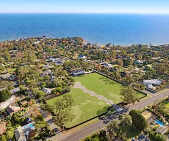
See their full listing at 2 Cedar Lane, Daylesford, VIC 3460. These images were originally published on nine.com.au/TheBlock.
Related stories
Native ad body.
Native ad body.

Native ad body.